Exploration
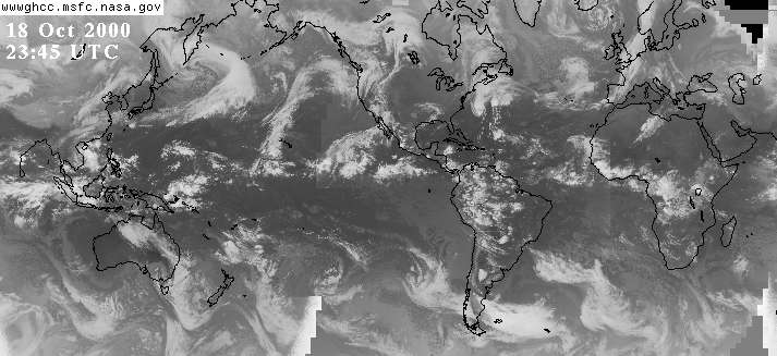
Q: Observing the following satellite images of Earth.we see locations of major horizontal cloud belts surrounding the Earth. Are there corresponding horizontal regions of no clouds? What are the major mega-geographical regions beneath the cloud belts and non-clouded regions.
My answer: It seems there's a cloudless belt along what I would guess is the solar equator. Sure enough, the cloud formations appear to spin off the equator following the Coriolis effect. That's neat!
I also look at this web site: http://wwwbel.lkwash.wednet.edu/projects/pacrim/global.html where I found the picture below:
This picture makes it even more clear that there is a band of clouds along the equator. I'm not sure what to make of this. I don't know if it's a recurring or continual phenomenon or a fluke, but it looks to regular to be a fluke. It appears that cloud formations prefer
Why are patterns more uniform in southern hemisphere than the northern hemisphere?
My answer: There is more land mass in the northern hemisphere, which messes up the wind patterns and the heat transfer patterns. As far as rotation goes, the difference is nil aside from mirror symmetry caused by the Coriolis effect which causes the cloud formations to eddy clockwise in the north and counterclockwise in the south.
Air flow demonstrates definite patterns over the surface of the earth. Latitudinal pattern of air flow in the southern hemisphere is more nearly perfect than that of the northern hemisphere.
This is an interesting observation, what questions it it inspires!
Part 2:
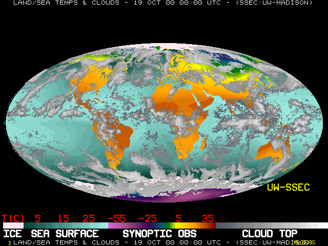
Identify the components of the global circulation system as determined from an examination of a current, small scale satellite image such as the world-wide montage found at the Space Science and Engineering Center located on the University of Wisconsin-Madison campus.
Changes in air pressure govern the forces that drive the winds. In the troposphere, air is about 78% nitrogen and 21% oxygen. Depending on the temperature, these molecules are bouncing around at an average velocity of something like 1700 kph. It is this bouncing around that makes air pressure. The contours of land masses cause friction when the wind blows and tends to slow it down. Also, the rotation of Earth causes the Coriolis Effect; that is, different latitudes have different linear speeds (Ecuador travels faster due to rotation than does Ohio) so an object travelling away from the equator (north or south) will be heading east faster than the ground and will tend to be forced east. Conversely, travelling towards the equator will induce a an apparent force to the west. In the case of a low pressure system where everything is moving towards the low, the Coriolis Effect creates a spinning vortex. The angular velocity of Earth is quite small: 360 degrees per day, or about .2 microradians per second. Even at fairly high wind speeds found in typhoons (40 meters per second) the Coriolis Effect generates a deflection of only about ten microns per second squared. Over an hour, this is a total deflection of about 100 meters...over a day a deflection of almost 40 kilometers. It adds up, but it takes time. The world-wide montage shows this pretty clearly.
Jet streams are narrow bands of high velocity winds in the upper atmosphere that generally travel from west to east. They are caused by temperature differences which lead to pressure differences. Since the temperature contrasts are greater in the US during the winter, the jet stream tends to blow faster here then. During the summer this greater difference in temperature tends to move northward and the jet stream blows faster over Canada. Since the temperature is greater near the equator than at the poles, there is a general drift of these streams away from the equator and towards the poles. Combined with the Coriolis effect, this produces the swirling effect visible in both the northern and southern hemispheres in the world wide montage.
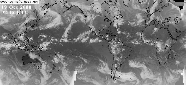
Consider the detail from the montage of October
19th showing the North Atlantic and Pacific:
 |
I don't really see it very well in the cloud formations over the Atlantic, but the elliptical path of clouds illustrates the "trade winds." These blow fairly regularly toward the equator from the northeast in the belt between the northern horse latitudes (a belt in the neighborhood of 30° N latitude characterized by high pressure, calms, and light variable winds) and the doldrums (a part of the ocean near the equator abounding in calms, squalls, and light shifting winds).
The Doldrums are also known as the Intertropical Convergence Zone and shows up very clearly on the the larger montage. This is the band of clouds along the solar equator where the northern trade winds and southern trade winds collide. Air in the Doldrums is churned high into the upper atmosphere where it flows either north or south about 30 degrees where it tends to drop down, causing high pressure zones. This is one explanation for why the area around Palm Springs (about 34 degrees latitude) is so hot and dry.
Between 60 and 90 degrees a roughly opposite phenomenon occurs. While the prevailing polar winds are from east to west with cold air from the hemisphere piling up to create high pressure at the surface. This high pressure tends to push this cold air back towards the equator where it begins to warm at around 60 degrees latitude. As the air warms, it rises and thus creates a fairly steady condition of low pressure zones at this latitude. The low pressure zones at 60 degrees tends to be cloudy and the high pressure zones at 30 degrees tend to be clear. This is readily observable on the montage. Since the oceans tend to be warmer in the winter, the low pressure zones over oceans are particularly pronounced.
Teacher Directed Questions:
Discuss their relationship to the global circulation system. What do you see at the ITCZ? Do you see the different pressure belts? (Polar High, Easterlies, etc.)
These questions were addressed above.
Part 3:
Look at the current
GOES
8 or GOES 9
satellite images. Select several for a variety of views. Good IR images
can be found
The Weather
Machine or at the Unisys Weather
site ( http://weather.unisys.com/
).
Teacher Directed Questions:
Identify as many of the four uplift mechanisms as you can find evidence for. What is the evidence? What latitudes are associated with each?
Well, the blue links above were not working for
me, but here are the latest and (right) images from GOES 8:
And here is the water vapor image:
east visible light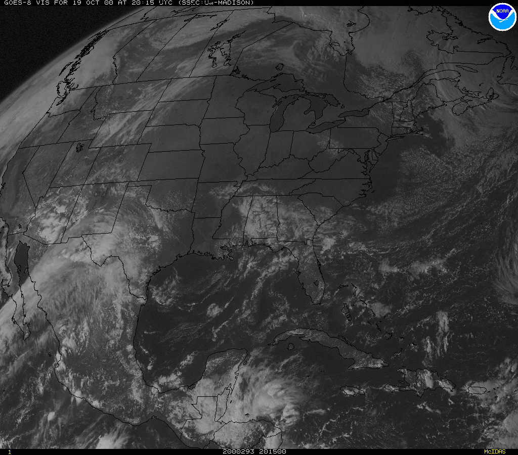 |
infrared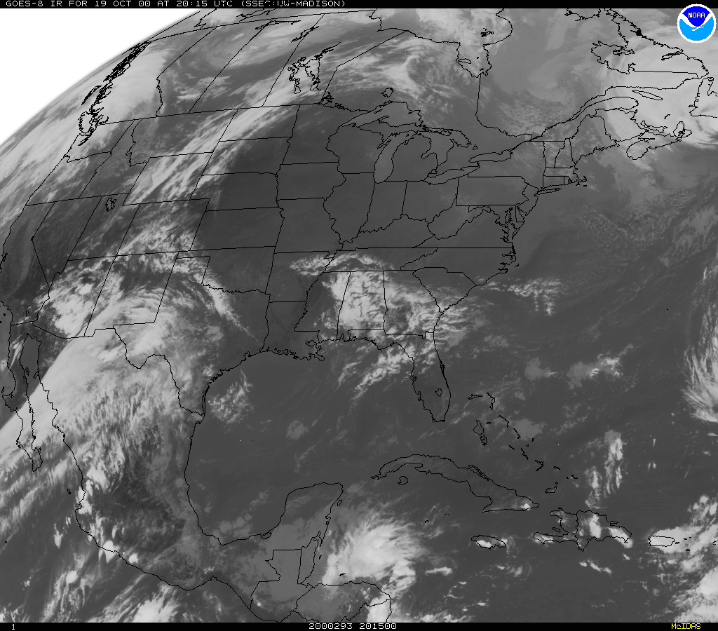 |
water vapor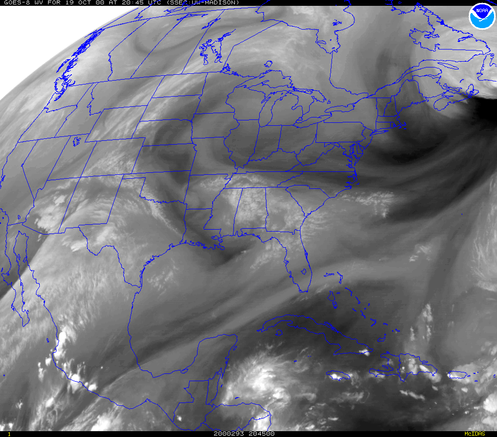 |
Infrared (western hemisphere) |
The evidence of uplift (condensation caused by wet cold air warming up, rising and cooling again in the higher troposphere?) should be evident at the equator and at the stormy latitudes, where air from high pressure zones tends to push against air from low pressure zones. In the western hemisphere image (above to the lower right) this can be seen where you would expect it: along the equator and along the storm latitudes (60 degrees north and 60 degrees south.)
Part 4:
Examine carefully the 500Mb
chart, the surface
map, and the IR
satellite image for the January 12, 1996 storm, showing the
development of a frontal system in the midlatitudes
of North America. Make particular note of the relationships between the
meanders (Rossby Waves) in the jet stream (visible
on the upper level charts) and the positions of the surface lows and highs,
and
the surface fronts. Note also pressure, cloud
pattern, and wind pattern associated with troughs and ridges; make some
general
predictions about conditions on the ground in
the middle of a trough, in the middle of a ridge, and near the vertex of
the trough.
Discuss your results.
Teacher Directed Questions:
Discuss pressure, cloud patterns, and wind patterns.
Students should download images and keep them in a portfolio with a
discussion about the image.
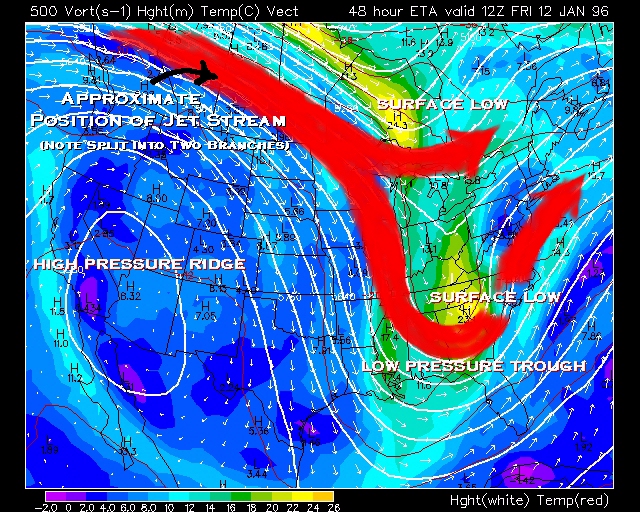
Well Developed High Pressure Ridge and Low Pressure Trough This view shows a very well developed high pressure ridge (isobars are shown by white lines) over the western United States, and a well developed low pressure trough over the eastern United States. Although closed contours, such as the one over the southwestern states, are relatively rare in upper level charts, they do occur. Notice how close together the isobars are at the apex of the ridge and at the vertex of the trough; more closely spaced isobars indicate higher wind velocity. It is very important to observe that the wind arrows are parallel to the isobars at the 500 Mb level, that is, the flow is geostrophic. Notice that the isobar spacing is beginning to narrow in the northwestern United States and southwestern Canada; this is the location to look at for the position of the surface high pressure. Notice also that the isobar spacing increases in the area just above the Great Lakes and again over the southeastern United States. These areas are the locations of the surface low pressure cells. The position of the Sub-polar Jet Stream is marked by the pathway highest velocity high level winds: over the top of the high pressure ridge in southwestern Canada, southwest where it splits into two branches, one north of the Great Lakes, and one south over northern Florida. Convergence aloft (southwestern Canada) creates a surface high pressure, divergence aloft (north of the Great Lakes and again over the southeastern United States) creates surface low pressure. |
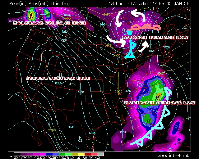
Surface Map, January 12, 1996 Storm The 500 Mb chart of this storm indicated that surface lows should occur
just north of the Great Lakes and over the southeastern
Notice the intensity of the precipitation associated with the two low pressure cells. There is more associated with the southeastern cell because it has relatively warm ocean water to draw from. The approximate position of the cold front associated with the SE cell is indicated by the heavy, pale blue line; there is not much of a warm front associated with this cell. Approximate locations of the warm (pale red) and cold (pale blue) fronts associated with the low above the Great Lakes have been added to this map. White arrows showing the direction of winds about this low have also been added. The area of heavy precipitation in southwestern Canada is due to relatively warm, most air being drawn off of the ocean and forced to higher elevations as it travels onto the continent. At the time of this map, the western states would be enjoying relatively mild temperatures and clear skies, while the eastern states would be suffering from unseasonably cold temperatures, clouds, and heavy precipitation. |
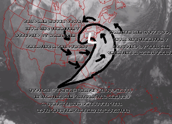
January 12, 1995 Storm, Infrared Satellite Image This is a satellite view of the same January Storm depicted in the 500 Mb upper level and surface maps. On this view, the typical "comma" shaped cloud mass has been outlined in black; the center of the low pressure cell is centered beneath the head of the comma. Black arrows have been added to show the direction of wind flow around this low pressure cell. In general terms, cold fronts are formed when cold, dry air moves down from the north, invading territory occupied by warm air; warm fronts form as warm air moves northward into areas occupied by cooler air. All air flow around a low pressure cell like this one is counter-clockwise in the northern hemisphere, opposite or clockwise in the southern hemisphere. |
Part 5:
Upper level atmospheric pressure maps can be found at the Boulder, Colorado Center for Atmospheric Research, Ohio State, or the University of Wyoming. Look at the current 200 Mb, 300 Mb, or 500 Mb pressure maps.
Teacher Directed Questions:
Determine by the contour line spacing where convergence aloft is likely
to be happening and where divergence aloft is likely to be taking place. From this, predict the positions of the surface highs
and lows. Compare your predictions to the actual positions of the highs and lows as shown on a surface pressure map. You can make a vector
field of winds aloft, assuming geostrophic flow and that wind speed is inversely proportional to contour spacing, if one
is not available. Each wind arrow in the vector field should be proportionate to the pressure gradient and parallel to the isobars;
from this, you should be able to determine where convergence and divergence aloft are taking place.
 |
 |
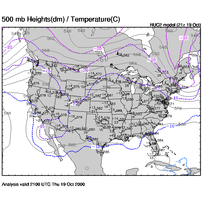 |
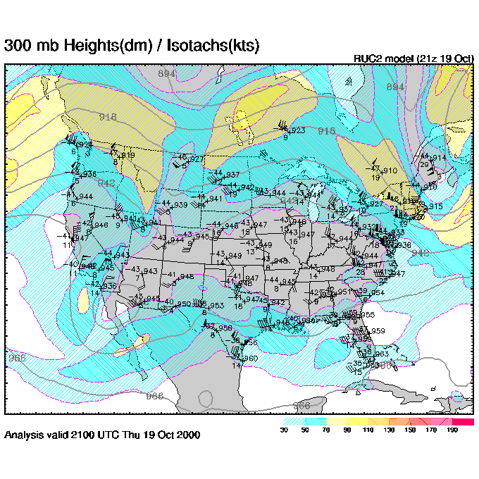
I found these to be a bit baffling. The title for the menu with pressures ranging from 200 mb to 850 mb is "Winds/Temp at Pressure:" And the title for each graph is something like "300 mb Heights (dm)/ Temperature(C)." What does this mean? Evidently each map is an overlap of two contour maps showing, for a particular pressure zone? (200 mb, 300 mb and 500 mb) isocline for both pressure and some other stuff ...including something that is measured on a scale of about 1100-1300 for 200 mb and 900-1000 for 300mb and 500-600 for 500 mb. Since this is the upper atmosphere, these numbers make sense as wind speed measured in, say, mile per hour. But to the less fluent, this could also be a measure of altitude. That is, how far up (above sea level?) do you go before you reach this pressure? The blurb which accomplanies these graphs resolves the issue; see the highlighted phrase in the descriptive blurb below:
Winds/Temperatures on pressure levels
Every day at 0000 and 1200 UTC, weather stations around the world launch
helium-filled balloons with miniature weather instruments inside a package
the size of a milk carton. These are called radiosondes or rawinsondes
and are launched at the sites shown on the map
found on the Upper-Air data page (as well as from other sites around the
world not displayed on the map). These balloons carry sensors for measuring
temperature, pressure and humidity (moisture). The measured data are relayed
via radio signals and received by the ground station where winds are computed
based on these signals or by newer GPS technologies. From these data meteorologists
obtain "soundings" or profiles of temperature, moisture, and winds with
altitude.
The graphics shown on the top of the Upper-Air
data page plot these data on a map of North America with temperature (°C)
to the upper left, dewpoint depression (°C) below it, altitude of the
pressure level (decameters) to the upper right, and a wind barb representing
the wind speed and direction. These data are fed into supercomputers
at the National Centers for Environmental Prediction which analyze the
data into a regular grid of data before predicting weather into the future.
The contours of temperature and heights are provided by one of these numerical
models (called the Rapid Update Cycle) which is updated every 3 hours using
not only rawinsondes (which are only launched every 12 hours) but also
automated aircraft reports (ACARS) and wind profiler data (see below).
This web site is very different than others in that the contours of temperature,
height, and wind speed update every 3 hours while the plotted station data
reflect the 12 hourly rawinsonde data. However, this means that noticeable
discrepancies may exist between the contour data and station data - use
with this in mind.
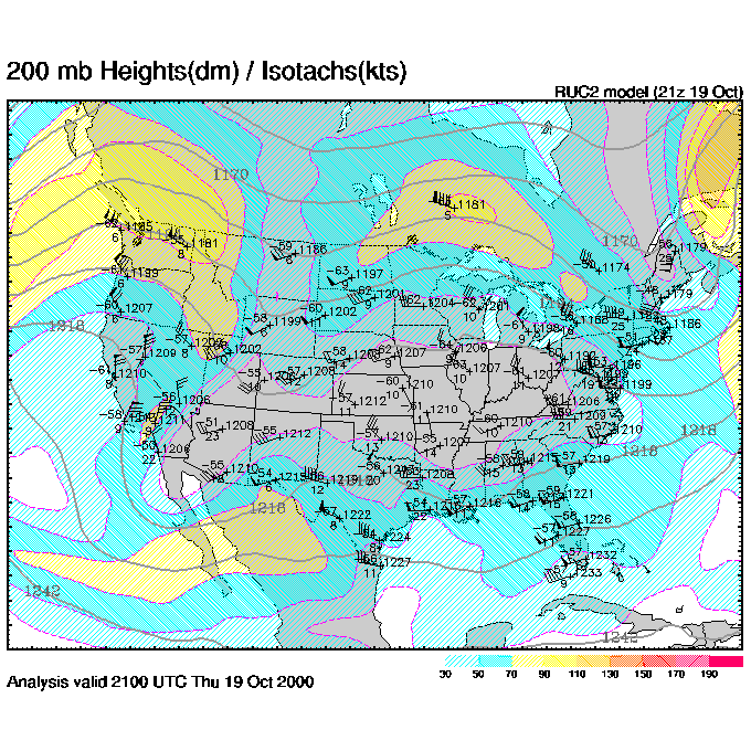
Consider the following detail which is from the
300 mb plot and includes Lake Superior:
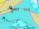
There are three numbers here corresponding to
each weather balloon's measurements.: -46 is temperature (C), 9 is dewpoint
depression (C) and 923 is the wind speed. There are also arrows showing
the direction of wind speed. So what happens is the balloon goes
aloft and these measurements are made when it reaches an altitude where
the pressure is 300 mb. Then all these data are fed into a computer
and the countour lines for temperature and wind speed are made for these
surfaces of constant pressure. Interesting!
Now the question is how to use this info to determine where compression and divergence are occuring. I would say that anywhere the arrows are pointing towards eachother we have convergence, and where they're pointing away from one another, we have divergence. Or, wherever there is a low pressure, there is likely divergence and wherever there is high, it may well be cause by convergence. I don't get it yet, really.